
What is a customer health score?
"A customer health score is a value that indicates the long-term prospect for
a customer to drop off or, conversely, to become a high-value, repeat customer
through renewal or cross-selling or up-selling strategies."
Source
Calculating customer health scores is becoming default for SaaS companies
along with the rise of customer success as a core philosophy.
Key lessons learned from gathering this list
-
A customer might churn today but the signs that they were going to churn
come months before. -
Some companies have very advanced customer health scores though often a
core few factors do 80% of the work. -
Get input from your customer success managers because you need to add the
empathetic art to the science. -
You can add 100s of factors if you have the time and resources to do so,
including machine learning to advance it further. -
Basing a health score around the customer journey is a nice way to anchor
the mind and keep perspective. -
You have the normal rating factors like Red, at risk etc but also add one
that identifies companies as 'Champions' to provide a new perspective on
your health sheet.
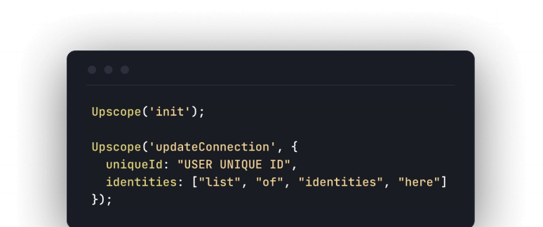
1. Upscope's own simple ranking system based on the core factor of usage

Upscope is next generation screen sharing built for
helping customers on the web.
The primary health factor we measure is usage.
Even measuring by simple usage needs great care to avoid common statistical
traps as you can see below.
The main factors for working out the health score
-
Total number of seconds they used it in the last month.
-
How much they're spending per second because if they're spending $600 per
month and using it 1 hour, that's a problem. -
Number of people they screen share with.
-
Amount of time the top 20% of a company's agents use it per month.
-
The number of agents that are using it.
-
The % of agents that used it the previous month that are still using it
this month. -
How much of the total usage is made by the bottom 50% of agents.
-
How much of the total usage is made by everybody but the top agent in
case someone has 10 agents and 1 is using it 60 hours per month and everyone
else is using it 10 mins.
As each factor is measured in different units (some are in seconds, some in %)
they're put on a scale between between 0 and 100 with 100 being assigned to
the top 5% so outliers with massive usage don't put everyone else at zero.
In the image above, the left side is the change in the score between the
current month and the previous month based on all the factors above.
Then they have weighting based on importance so some factors are multiplied by
the weighting.
Then they are all summed together and again put on a scale between 0 and 100
with 100 being the top 5%. The top 5% of teams will always be 100.
On the right hand side is a much simpler indicator which is the total number
of screen sharing hours for the whole team. This is marked as stable, positive
or negative.
There's also an option to filter the list by paying, trialling, cancelling and
all.
2. Assignar divide it between product and relationship

Rachel Jennings at Assignar recommends the following to identify those at
risk.
Define sub-categories that mean a customer is at risk
-
Reduction in usage
-
No/small usage of key features
-
Too many or no support conversations
-
Low survey scores
-
Sudden stop in references/speaking engagements
-
Overdue invoices
-
A combination of the above
Define actions to measure for each of the above sub-categories
Then define specific actions to measure like logins and customer interactions
for each of these.
Place them into either of 2 main categories labelled Product or
Relationship
Product makes up 60% of the total and Relationship 40%.
Score it
Each sub-cateogry is scored out of 5. 1 is danger zone and 5 is healthy zone.
See more on Rachel Jennings calculated health scores at
Assignar
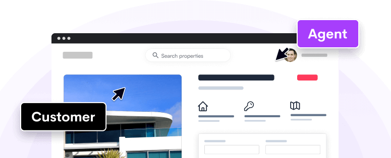
You probably don't know about next generation screen sharing

Customer support, success and sales teams would love to see what the customer
sees.
But they can't set up a Zoom screen share every time a customer gets stuck.
In a perfect world, you'd see the customer's screen in one click and use your
mouse on it.
You can now do that with next generation screen sharing. Get
Upscope
3. David Lahey says map your customer journey

There's a simple flow to how David recommends creating your health score and
the step of mapping your customer journey is central to that.
First he states that if you are not confident in your data then don’t
proceed with this exercise until you are.
1. Segment your data by importance
Segment your customer data by stage, size, and/or location e.g:
Stage: Prospect, trial, deployed.
Size: Small, medium, enterprise.
Location: US, EMEA, APAC
2. Get your criteria to measure by mapping your customer journey to return
on investment e.g. measure customer journey steps starting from open rates
on the email they sent inviting colleagues to the platform, all the way
through to whatever you think actual ROI is for your customers.
3. Ask your product engineering teams to get the data showing usage, feature
adoption etc and match it to the criteria above. Put it all into rows into a
spreadsheet.
4. Add the segments from step 1 to the sheet and then crunch the numbers
to determine red, yellow, green in a step which requires both art and science.
See how David Lahey recommends applying the green-yellow-red in
full
4. Pendo adds 'Champion' to the health scoring categories

Pendo uses Breadth, Depth & Frequency (BDF) to measure a customer’s health
but what we like is the addition of 'Champions'.
Identifying champions as much as simply risky or healthy accounts helps
marketing, customer success, sales and other teams identify and build new
channels and processes that find and convert more champions.

See more on Pendo's BDF customer health
breakdown
5. Moe Nada shows you a scoring system for larger B2B accounts over 1 year
in age

This formula concludes the health of the account into four main categories as
following:
**Stability
Maturity
Innovation
Adoption**
Each category has set of sub-categories like total outage counts,
participation of customers at events, are products on latest versions, how
many products from the company does the customer own, does the customer take
part in beta programs or testing, have there been any upsells etc.
It's a great breakdown and brings in a number of unique factors to consider.
Sub-categories are then weighted individually and overall health score is
evaluated as follows:
Healthy: if the score is more than or equals to 7.5
Infected: if the score is more than 5 and less than 7.5
Sick: if the score is equals to or less than 5
See more on the scoring system for larger B2B
6. UserIQ monitors 5 key churn indicators

UserIQ’s customer health dashboard monitors five key variables called “churn
indicators” that are used to calculate Health IQ.
-
Login activity is based on frequency of logins
-
Feature Adoption is based on the number of unique features that each
account is using within the product. -
Sentiment is tracked through Net Promoter Score (NPS) surveys
-
Technical Support is calculated based on the number of support tickets
that are fulfilled and closed by an account or customer. -
Financial Health is measured by a customer’s monthly rate, whether
payments are made on time or delayed, and the validity of the account’s credit
card
To truly understand the health score the users need to be put into segments.
The post goes into greater detail on that.
See more on UserIQ's customer health score churn
indicators
7. Asana's example shows you the work it takes to build a serious heavy
duty, machine learning based customer health score

We're not even qualified to comment and breakdown this article but in short,
Asana iterated the process and by the end of it included a myriad of factors
that most companies don't consider.
Read the article if you want to understand the work a big company puts into
iterating a large process in-depth.
Account Health Score (AHS)
Asana first created a 'simpler' health score system.
"Asana equipped customer success with what they need to successfully reach out
to unhealthy accounts by iterating and expanding their model."
"The Account Health Score (AHS) is that metric, and it does exactly what its
name suggests; it’s a measure of how well a team on Asana is doing. This value
on a 100-point scale is computed by combining a short list of engagement
metrics."
Account Health Score 2 (AHS2)
The original system was then upgraded and improved.
"When the AHS was created, the data program at Asana was in its infancy. Since
then the available data has expanded tremendously."
"Once limited to visits and records of core actions, we now have data about
things like how many employees work at the companies that pay for Asana,
whether the account’s users are concentrated within a single geographical
region or spread across many, and how reliably payments are made."
See Asana's full post on data science and health
scores
Next, see how to teleport** over to your customer** and forever
change how you support, sell to and onboard
them