


I tested out the Intercom integration, Statbot, to see what actionable
customer service metrics I could harvest. And guess what? I plucked some
pretty interesting results! If you’re searching for Intercom metrics that
prove you’re improving, take a look!
Those quarterly reports
Say you’re a Customer Service Manager. Maybe you already are. Think about all
of weekly/monthly/quarterly meetings you have. You know, the ones where you
have to show your boss actual facts and figures. The stats. The metrics. The
proof. Whatever you want to call it… You need to justify its existence with
data all the whilst sourcing metrics that make your boss say “I can see what
you’ve done, how it’s going and compare it to the stats from last quarter.”
After my little test, I discovered that customer service metrics can easily be
sourced from Intercom and Statbot… (Hence the title guys!) But before we get
ahead of ourselves, let’s take a look at the customer service and support
metrics that we should be sourcing in the first place.
-
Conversation metrics
-
Response Time
-
Customer Satisfaction
-
Retention rates
For those of you who don’t know already, Statbot is a
3rd party Intercom plugin. Every large platform seems to have a company like
Statbot that specialises in producing stats for the main platform e.g.
Baremetrics for Stripe. They’re specialists in one area and take the time to
display data in ways Intercom does not yet have time for.
Below we’ll show how both Intercom and Statbot display data.
Total Conversations
A simple, possibly underestimated, yet powerful stat. By tracking this over
time, you have a full overview of support trends. Of course, don’t go nuts and
start basing everything around this one stat, as some conversations are not
meant to be responded to.
Intercom
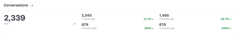
Statbot
Intercom
Conversations per teammate + per day
Well this one is also pretty self explanatory. You are able to see how many
conversations your customer service team are having. It is a great indicator
as to whether or not, some members of your team may need some help with the
quantity of conversations they are dealing with. It also acts as a guide as to
how many conversations everyone should be having on average per day. That
being said… There are other factors that can change these results. Sorting out
complicated and lengthy customer issues can change this Intercom stat, so it’s
important to use this metric as a KPI for team members, rather than a set
standard of work. There’s no need to exhaust your lovely customer service
team!!
As stated previously, conversations per teammate is unique to your team and
how the live chat conversations are dealt with. If you’re looking to estimate
a per-day benchmark for your customer service team,
Geckoboard
states that “dividing the total average number of conversations per week by
the number of team members you have. Then divide it by either 5 or 7 depending
on when you offer support (business days only or 7/days/week).” This average
will at least provide a starting point for your team, that’s adjustable as the
workload changes. It also gives a rough outline of the amount of work that the
customer service team is doing.
Statbot
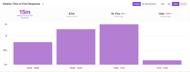
Response Time
Not so surprisingly enough, a lower response time is always better. Nothing
worse than leaving your customers and potential customers hanging.
However, this metric does depend on the way that you respond to each group of
people. For example, some companies, not all, respond to paying customers
quicker than those who aren’t paying. Response time is also not resolution
time and while it’s ideal to have a statistic for ‘first resolution’ time,
that’s a lot trickier to measure purely by stats. However, response time does
matter to customers and will impact sales.
According to Live Chat Inc’s 2017 Customer service
report,
the average live chat response time for a business is 56 seconds, down from
the 59 second response rate in 2015. So, inevitably businesses that respond
quicker to everyone, are going to attract more people on live chat.
For a useful metric, Intercom
recommends looking
at a 90th percentile value. This is the longest wait time for 90% of customers
who get in touch.
It’s also important to take note of response time by weekday and hour. This
allows you to see the times and days that you need to improve response time.
That’s going to make organisation a breeze, as you can schedule shifts
accordingly, and possibly grow your customer service team to fit the needs of
your customers.
Intercom
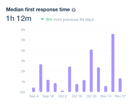
Statbot
Overall Team Performance
I love this Intercom metric from Statbot. It is the easiest way to quickly
glance and see the overall performance from everyone in your team. It includes
the number of replies sent, conversations closed, Median time to first
response in the last month, and median time to close. This shows each member
of your team what they need to improve on, whether it be response time or the
amount of replies sent. The best way to determine the improvement is by
comparing last month’s overall team performance stats with the current month.
A simple, yet effective Intercom metric to take note of!
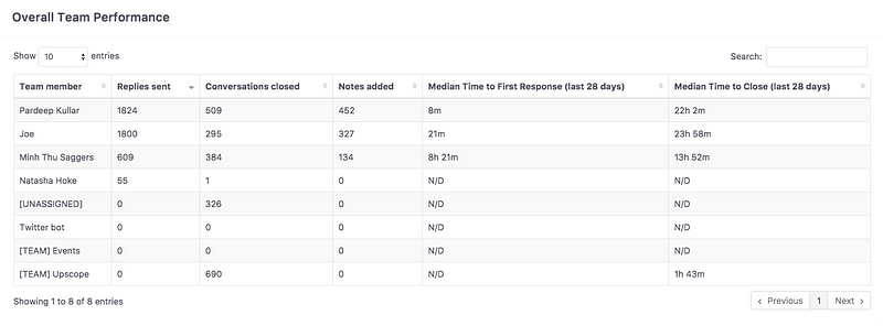
Overall Team Performance — Statbot
Customer Satisfaction
Now, as we’ve just gone through the importance of speed with the response time
metric. It’s no surprise that you’ve also got to consider the quality of the
responses.
I recently read an interesting
Marketo
article that stated:
-
“66% of B2B consumers want to advocate for brands that engage well.”
-
“66% of B2B consumers fully expect that all communications with a brand to
be personalised.”
With such a high numbers, you need to keep the quality up for everyone who
messages you on live chat, whilst being speedy. I know, it’s always a
combination thing. So, a low response rate and high conversation quality is
key here! I mean, no matter how fast a company responded, if their message was
absolute crap, you wouldn’t take the time out of your day to recommend the
company to a friend, let alone purchase their product.
Well, the great thing is, as you’re able to measure the speed of the
responses, you can also measure the customer satisfaction quality too.
“There are two primary basis for great customer relationships: communication
and trust. Trust is earned, so leveraging communication to develop a
customer’s trust is the best strategy for relationship-building. Use product
usage data to help you communicate to the right users at the
right time for the right reason.” — Keri Keeling, VP of Customer Success and
Operations at Bluenose Analytics.
Of course, there are many ways to measure customer satisfaction. One being
surveys and customer feedback. Intercom plugins, such as
Survicate, integrate advanced surveys that
collect users’ feedback and data. You are also able to add a Net Promoter
Score (NPS) survey to the bottom of emails, and identify cancellation reasons
to reduce churn rate.

Retention Cohort Analysis
Of course, to some, a retention cohort analysis can seem fairly confusing.
Oddly enough, it’s pretty much a fancier version of a google spreadsheet. That
being said, if used properly, it’s the holy grail of SAAS businesses.
Intercom’s Retention, cohorts and
visualisations
article explains it best.
In the Statbot application, there are two different types of retention cohort
analysis: Users and Companies.
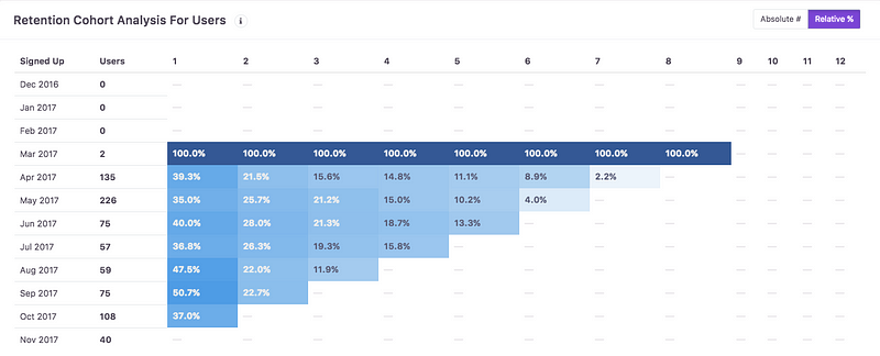
Retention Cohort Analysis For Users and Companies
‘First column is given month. Second column is amount of users/companies
registered in that month. Next 12 columns is amount (absolute or percentage)
of users/companies that were seen after 1st of given month. E.g., for May 2017
column labeled ‘1’ shows amount of users that were seen after 01 June 2017,
and column labeled ‘5’ shows amount of users that were seen after 01 October
2017’ -Statbot
Benefits of reading the cohort table:
-
Product Lifetime- (Vertically) Compare different cohorts, to see the
percentage of customers that return to your app. The comparison and
(hopefully) improvement can be a reflection of your onboarding experience and
the performance of your amazing customer success team! -
**User Lifetime- **(Horizontally to the right) As you go along the
chart, you can see how the retention develops over a the customer lifetime.
This is linked to the quality of your product and customer support team.
But how do I break this down?
-
Divide users from when they first joined/signed up for your product. You can
break down your cohorts daily, weekly or monthly. This shows you the period of
time that your customers continue to use the app. -
Another great way to analyse the information is charting out a retention
curve. This shows the retention over time and makes it easy to identify the
time that customers are leaving your product.
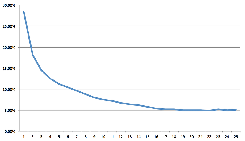
For example on the chart below, we can see a steep drop, where customers are
leaving quite early. So, obviously, this means you need to improve onboarding.
An article from Popcorn
metrics
states that ‘For website and web-apps, typically 60–80% of new users are lost
within the first week of signup.’ The curve should flatten over time, if not,
you would need to improve customer engagement.
Rest assured…
I am not the most analytical person. So, I was pleasantly surprised with how
easy it was to use and understand Intercom metrics from the Intercom platform,
and Statbot. You really realise that the right data answers important
questions, allows you to track progress and plan strategically. (Most
importantly, if you work in customer success, you’ll look like a boss in the
reports meetings) :).
The combination of Intercom and Statbot metrics works as a powerful tool, that
when used right, will reduce churn, improve customer satisfaction and
onboarding, and keep the customer support team heading in the right direction.